What is a Hamburger menu - Upgrade
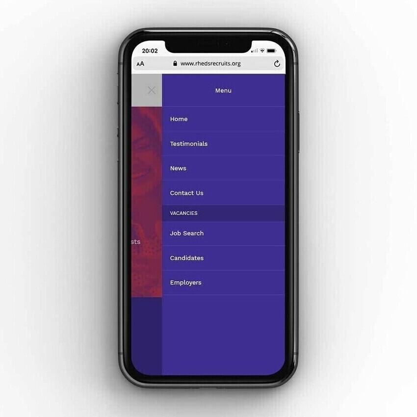
A hamburger menu is a common icon used in mobile and responsive website design. It usually looks like three horizontal lines stacked on top of each other like a hamburger, which is how it got its name.
When tapped, this icon opens up a menu that displays links or navigation options for the website. It helps keep things tidy by hiding the menu until the user needs it, which is especially useful on smaller screens like phones and tablets.

Why is it used?
It is mainly used for mobile devices where space is more limited. It is recognised as the standard solution for mobile navigation.
A hamburger menu allows you to:
- Keep the navigation hidden until it's needed
- Maintain a simple and uncluttered layout
- Provide easy access to all your important pages
Does my website have a hamburger menu?
Our designers might have already built in the hamburger menu when designing your bespoke website. You can check this yourself by doing the following:
- Open your website on your mobile phone or tablet.
- Look in the top corner of the screen (usually top right or top left).
- If you see the icon, give it a tap, your website menu should slide or drop down from there.
If you don’t see one or aren’t sure if it’s working as it should, feel free to get in touch with our support team and we’ll be happy to help.